Do your fleet graphics have effective style? What does style mean to you when it comes to fleet graphics? Are you sending the right message with your fleet vehicle graphics or even sending a message at all? Whether your business is large or small, a good place to start is with a brand style guide, to keep your brand and marketing on track.
What’s a brand style guide? A brand style guide is a document that shares a business’s expectations of how they wish to be presented in advertising, social media, public relations, and any other places their brand is shared, mentioned, or copied. Here’s a good example of a brand style guide from The SBA (Small Business Administration.) It shares a brand guide covering logos, color palette, texture, images, and more, SBA Brand Guide.
Fleet Graphics Styles
First, you must understand the message you want to send and who you want to reach before you choose a fleet graphics style. Start by defining the problems you solve. Who do you help, and how do you help them? Too often, when companies look for their target audience, they focus on the features of their product or service. Forget about features…how does your product benefit the customer? What does it do for them? When you can answer that, you’ll know who your target audience is, which will help you choose the right style for your fleet graphics.
Share a Message
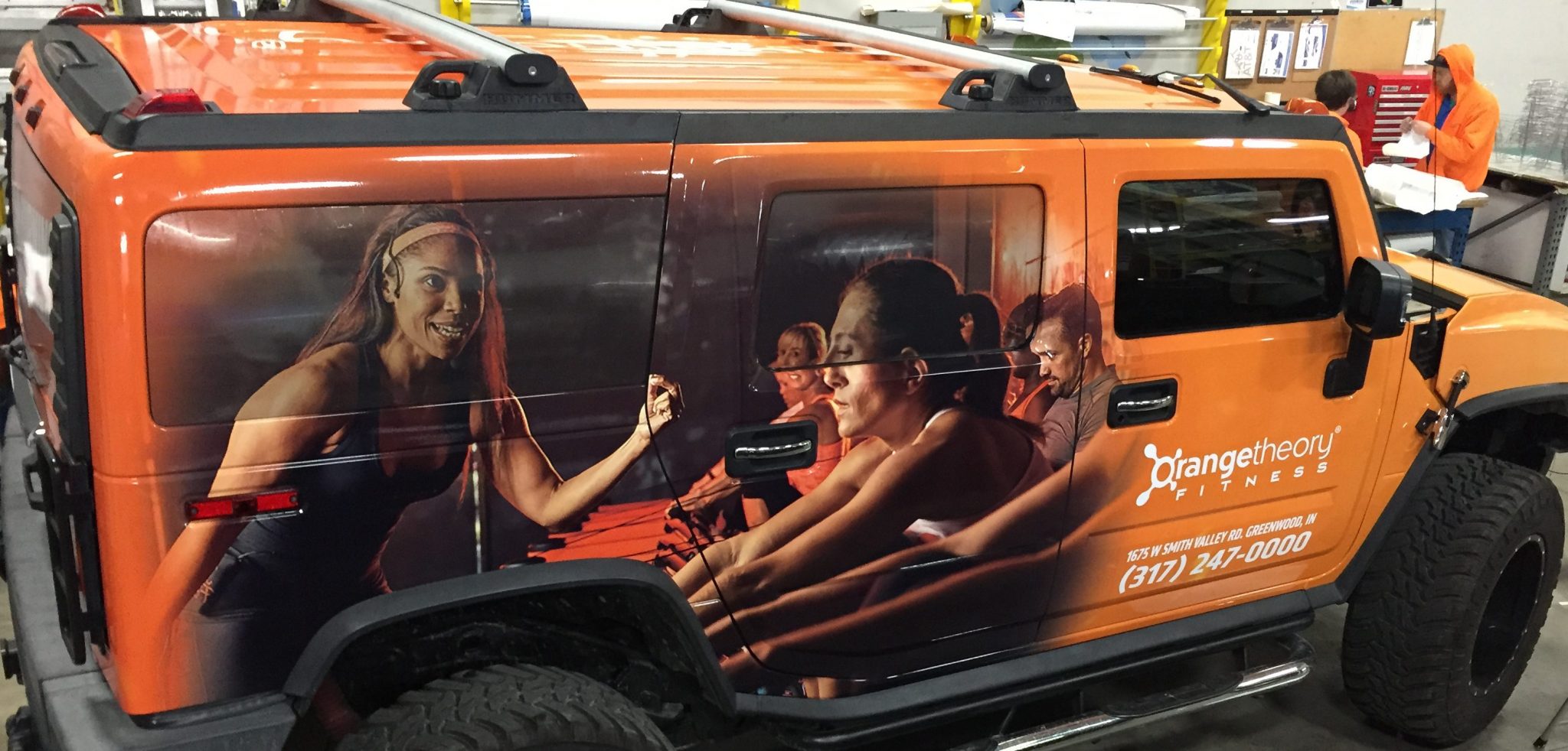
Do your fleet graphics share a message? Is it the message you intended to send? For example, the message on this wrap is clear; working out is healthy. You want good health, don’t you? The wrap screams that Orangetheory fitness can get you there.
The Orangetheory Fitness wrap has it all: branded colors and fonts, white lettering on the orange background that stands out. The design fades effectively from the branded orange to images of trainers and members. The images use all the space possible, including the windows. One can almost hear the heartbeat of the gym while looking at the photos of trainers and members.
Don’t Send the Wrong Message
The wrong message is often apparent to the outsider but not to the stakeholders. It’s the forest for the tree’s syndrome. The wrong message can sneak up on you by being outdated, worn out, and tired. It could be because your fleet graphics don’t mirror your organization’s professionalism or share your business goals, culture, or mission. If such is the case, then it’s time to reset the clock and bring your fleet graphics back to life. The wrong wrap sends the wrong message, and that’s not what your business needs or wants.
Have Some Fun
If your business is all about fun, then your graphics should reflect that. I remember seeing vehicle graphics on a box truck for a business that set up entertainment for parties. The crew was setting up a bounce house for a child’s birthday party. It had the company name, logo, contact information, and a list of services, bounce houses, pony rides, magicians, and more. There were no images. The vehicle graphics weren’t taking full advantage of the businesses fun imagery to help capture the attention of potential customers.
Here’s an example of a fun fleet graphic from a fun business. The Craftroads Beverage box truck wrap is fun times three. It has three different messages on one vehicle. Separate, stand- alone graphics are on each side and back of the box truck, and all embrace the fun.
On one side, you have Pseudo Sue, a purple and green T-rex with bright white fangs flaring on a background of yellow images of hops. It’s the logo for Toppling Goliath Brewing Company’s signature pale ale Pseudo Sue.
The other side is an entirely different story. Red, yellow, and green apples are scattered on a gray wooden board. The apples are the backdrop for the Ash & Elm Cider Company logo.
Support a Cause
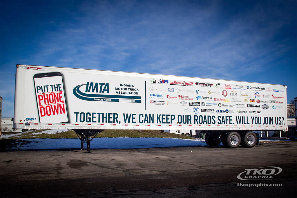
A worthy cause is always appreciated on fleet graphics and can make a big impact. The IMTA (Indiana Motor Truck Association) knows this, and put this trailer to good use, while spreading awareness about distracted driving.
Some fleet graphics make a difference. “PUT THE PHONE DOWN” from IMTA is one of them. Distracted driving is now an offense in Indiana! We’re proud to be a small part of it. The IMTA has not only served the interests of the trucking industry since 1934, but also motorists, with safety programs, support of infrastructure initiatives, and actions for the general good, such as the campaign to stop human trafficking. The IMTA is good for trucking, good for business, and good for the people of Indiana.
Create a Call to Action
Pay attention to the service people in your neighborhood and their vehicles. You’ll notice that some vehicles have very little graphics, which doesn’t instill confidence, while others look clean, professional, with graphics that include calls to action, such as 24-hour emergency service.
If you want to catch someone’s attention, make their life easier and solve their problems. Do you offer 24/7 service? Tell it and sell it with copy and an image of your repair person. Do you offer remote auto services, pick up and deliver dry cleaning, or guarantee same day service? Whatever your USP (Unique Selling Proposition) is—sell it with words and images in your fleet graphics.
Get Serious
Nothing may be more serious than emergency vehicles, whether it’s police cars at an accident scene, Fire trucks on the way to a fire, or an ambulance saving someone’s life – the vehicle needs to be taken seriously.
Unlike many organizational vehicles wraps, the Hendricks Regional Health Community Paramedicine Wrap isn’t cluttered with information. There’s no need for it. Detailed copy and multiple images would get in the way of identifying this vehicle. But there’s more to it than a simple wrap. This vehicle graphic stands out. The brilliant bright green outlined in black flows from front to rear.
It almost looks as if it’s moving when it’s sitting still. Even parked, you can tell it’s ready for action. Finished off with the door decal, including the branded H and Community Paramedics, there’s no doubt the purpose of this vehicle.
Do Your Fleet Graphics Have Effective Style?
So, do your fleet graphics have effective style? Or more importantly, does your style match your brand? If you’d like an expert opinion, we’d be more than happy to offer our advice. That’s our style. Don’t hesitate to Contact Us, or you can request a quote today! So, tell me do your fleet graphics have style?
TKO Graphix has been producing large format graphics, fleet graphics, and vehicle wraps since 1985. Our large-format production capabilities include screen printing, digital printing, and plotter cut graphics. Our state-of-the-art manufacturing facility is designed to create the highest quality graphics with the latest equipment and best materials in the industry.


