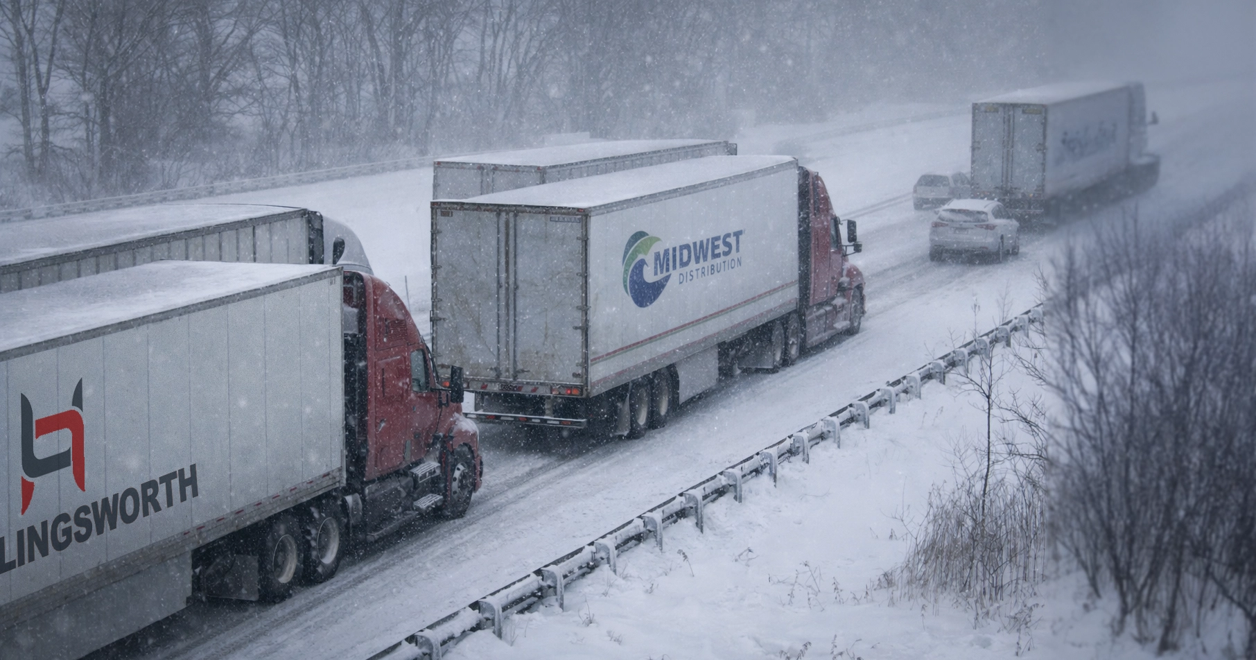
When form and function collide, it leads to vehicle graphic fails.
We’ve seen too many vehicle graphic fails, and you’ve probably seen them on the road as well. Images that don’t fit the product, fonts that are too small to read, designs disrupted by the body lines of a vehicle, and more.
When form and function collide, marketing’s caught in the middle. Your branding and advertising take the hit from the collision. We utter form and function in the same breath, connecting them at the hip. It’s never more evident how critical it is that they complement each other than in vehicle graphic design.
Good design begins with understanding the function, the purpose of the design. For example, in fleet graphics, the function may be to support the brand, create a CTA (call to action), or share a USP (unique sales position).
SignCraft Magazine shares that effective wrap design gets more important every day. “A wrap is a unique opportunity to create high-impact mobile advertising. Its strengths include using the whole vehicle as a super-graphic, changing the color or color scheme of the vehicle to colors outside the conventional color palette of factory paint colors and the ability to incorporate special effects and images into the wrap graphics. A good wrap design should be a sort of visual surprise to viewers—something they notice, which draws them into the message.”
You’ve heard the saying form follows function. In vehicle graphic design, it’s more like form governs function. A design that doesn’t fit the form, in this case, a vehicle, doesn’t achieve the function. A design that’s too small, too large, or the message gets lost in the background, doesn’t accomplish the intended function regardless how stylish the design. When form and function collide, it leads to a major vehicle graphic fail.
When the design is distorted by the form, such as around curves, the message (aka – the function) can be lost. In vehicle graphic design, the function, must follow form or the purpose is lost or worse….
The Tale of a Vehicle Graphics Fail
For 10 years, I’ve worked in the same room with several of the best vehicle graphic in the country. I recall a designer showing me artwork sent by a customer to wrap several work vans. The design sent by the customer hadn’t taken into consideration the sliding door on the vans. In the original design, important copy covered the door. However, when the door was opened, the remaining letters spelled a curse word! Thank goodness, our designer caught the oversight, and the project didn’t move forward as originally designed.
Huge Vehicle Graphics FAIL.
4 Vehicle Graphic Form and Function Design Considerations
1. How will the design fit the vehicle?
If the vehicle has contours and curves, how will the design look when conforming to them? Many designs look great on a one-dimensional computer screen. However, you must consider how the design will translate on to the curves and body lines of the vehicle. One of the keys to fleet graphic design is fitting the one-dimensional design on a three-dimensional vehicle.
2. How will size impact function?
It may be obvious, but a small logo that looks good on a business card may not look the same on a 53’ trailer. As clear as that may be, we see the mistake more often than we should.
3. How will light affect the design?
The easiest example of how light affects a design is the difference between day and night. If a design needs to be seen at night, lighter colors and reflective adhesive vinyl should be considered.
4. How will color impact the design?
The impact on design by color has many levels. Will the color of the design match the branded colors? How will the graphic contrast with the background design or of the painted vehicle? What colors attract attention? What colors are common to your type of business? A vehicle graphic designer can answer all these questions and more.
It’s True – When form and function collide you’re left with a vehicle graphics fail
The four outlined areas above are examples of how form affect function, but there are dozens of considerations that vehicle graphic designers must take into consideration when designing vehicle warps, from the type of vehicle to the production process of the graphics. Each project is different according to the vehicle, or vehicles in your fleet, and the goal of the message.
Our design team bridges the gap of form and function with their designs for fleet and vehicle graphics. Let TKO Graphix help you create an effective message on the vehicle you have so you don’t end up with an epic vehicle graphics fail.
If you’d like to learn more, our designers have the answers. If we can answer any questions for you, don’t hesitate to contact us or request a quote today!


