Can you make my truck look tough?
We get questions like this more often than you may think. Instead of “tough” sometimes it’s, “Can you make our trucks look cool?” or “How can we make my vehicle graphics pop?” However you say it, it usually means the same thing to us, — you want vehicle graphics that displays your brand’s personality, stands out, and attracts attention.
Of course, we can do that!
There are design elements that can make vehicle graphics appear more rugged, industrial, and even tough. Whatever message you want to send, our team of outstanding fleet graphic designers, with more than 50 years of combined experience, can create a road-worthy look for your business you’ll be proud to drive. Check out our portfolio for ideas.
Creating a Tough Vehicle Graphic for Your Business
If your business calls for a tough look with your vehicle graphics branding, here are some design tips…
- Try using bold, warm colors with large bold fonts on your vehicle graphics.
- Adding strong design elements will enhance the look. For instance, adding elements like flames and grunge textures.
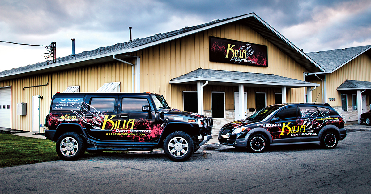
- Throw in some unexpected elements like these monster claws. Just for a little shock factor.

Design Elements: Example of Grunge Texture and Monster Claw
Our friends at Killa Dent Removal did just that with their fire red flames and monster claw. Their brand is based on this bold and edgy look. It works great for them!
What to Avoid
To get that big bold look you want, stay away from soft colors and organic rounded edges. Imagine seeing a construction company with a bright pink truck and playful kittens on the side. HA! Everyone loves playful kittens, but please don’t put them on the side of your Ford F-150 SuperCrew for your construction company. At first glance, a prospect will not recognize what type of services you provide. Using the wrong image or design elements creates a look that’s confusing and sends the wrong message.
Message-First Vehicle Graphics
Keep in mind that the most crucial consideration in any vehicle graphic design is getting your message across to potential customers quickly. So, yes, we can make your truck look tough, sporty, retro, artsy, etc, but we also want you to attract business with your vehicle graphics.
We don’t want a busy design to cloud your message. Let’s say a construction company did want images of kittens on their trucks — perhaps they could have them in hardhats and holding hammers — using the kittens to capture attention and then leading the eye to the brand’s message.
Here’s 3M™ thoughts about staying on brand. “Your graphics should help tell your brand’s story and reflect your brand’s identity. Keep your graphics on message with branding that is consistently applied across your fleet. Even if there are variations in design, it is important to stay on brand and communicate the same overarching story. When wrapping your fleet, use consistent themes, colors, and/or images to create comparable appearances. This helps increase brand recognition and provides more impactful reinforcement to your audience.” — 3M – Tips to maximize your wrap’s impact
If you’ve ever noticed an organization’s vehicle that presented a specific image but an unclear message — you understand the importance of message-first vehicle graphic design. In today’s competitive marketplace with advertisements bombarding consumers for their attention on signs, billboards, and other vehicles, your vehicle graphics need to stand out, be clear, and stay on message.
If you’d like to brainstorm a message-first design for your organization, give TKO Graphix a call at
888-544-8051 or Contact Us online because we get the message.


Leave A Comment