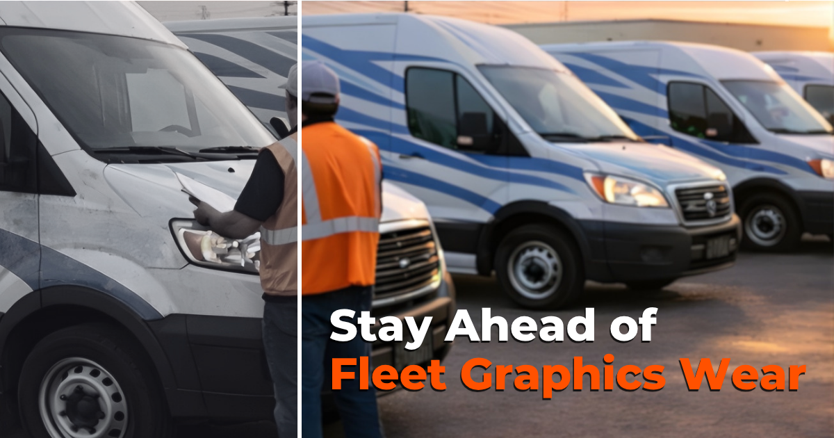
Is it time to replace your fleet graphics? Before you answer this question, go outside, walk to your parking lot and take a close look at your vehicles. Check out your vehicles the way a customer might. Look at them the way you’d look at another company’s cars and trucks. If your vehicle was sitting in your driveway at home, there to complete a service, would the appearance and condition of the vehicle inspire confidence? Would you think it was time to replace your fleet graphics?
Is it Time to Replace Your Fleet Graphics?
Use this Checklist to Determine if it’s Time to Replace Your Fleet Graphics
Place a check mark next to each item that fits or describes your fleet.
1. _____Are the vehicles dented, rusted, faded, or scratched?
“There’s a misconception that vehicle graphics, especially a full wrap, can “hide” damage to a vehicle’s body. Minor damage such as fading and very small scratches may be covered and concealed, but not damage. Rust, dents, scrapes, bends, and bows will all show through the graphics and cause problems. — FAQ: Can Graphics be applied over body damage?
2. _____Are the vehicles uniformly branded?
Or are there three different versions from three different eras, and three different graphic design teams. Not only should the vehicles look the same but the colors, logos, and taglines should be the same as your advertising, social media, and website.
“Color, fonts, and logos on your fleet graphics should match your brand. The logo and company name people see on your website or Facebook page should match what’s on your vehicles. It’s not always possible to match 100%, but it is always possible to be a recognizable brand. If someone is familiar with your organization and sees your car or truck, they should immediately recognize it as belonging to your business.” — 4 Critical Keys to a Successful Fleet Graphics Design
3. _____Is there a visible CTA (call to action)?
Is all contact information accessible and easy to read, including street address, phone number, and website URL? Did you share you’re USP (Unique Sales Position) such as, “24 Hour Service” or We’re Always on time, or it’s FREE”?
“Are your phone number and web address easy to read and to find? Is it on every side of your vehicle? Is Contact info on all sides and is it an easy to read font and contrasts well against the background? Are the fonts large enough to be seen from 30 to 50 feet away?” — How to Create an Effective Vehicle Graphic CTA (Call to Action)
4. _____What’s the condition of the graphics?
Are they faded, torn, or scratched? Are parts of the graphic design missing? A bad wrap may be worse than no wrap when it comes to your image and the public’s perception. “Recently while commuting to work, I was stopped behind a local retailer’s delivery truck. The retailer is marketed to an upscale niche, and their brick and mortar outlets are well designed, tastefully decorated, and impeccably maintained.
They offer excellent service, customer follow-up, and after-market training. The box truck I was stopped behind sent a different message. It shouted, “WE ARE SECOND-RATE!” When it comes to vehicle graphics a bad message is worse than no message.” — A Bad Message is worse than none
5. _____Are the graphics little more than an identification decal or do they send your company’s message
“Companies are beginning to understand they shouldn’t only identify their vehicles with a company name and vehicle number, but they should also advertise on the vehicle. A vehicle or trailer is a rolling billboard. Organizations that continue to limit vehicle graphics to identification, and not advertisement, are missing what may be the lowest cost per impression advertising available.” — You’re Driving Your Best Advertising–Use it.
6. _____Has the direction of the organization changed?
Do the graphics no longer fit the culture and marketing initiatives of the company? “Are the vehicles uniformly branded? Or are there three different versions from three different eras, and three different graphic design teams. Not only should the vehicles look the same but the colors, logos, and taglines should be the same as your advertising, social media, and website.” — Is it Time to Replace Your Vehicle Graphics?
7. _____Is your message stale?
Is it time to breathe new life into your fleet? Is it time to replace your fleet graphics? How important are fleet graphics to your brand? A survey from the American Trucking Association emphatically answers that question. “75% of the people surveyed developed a first impression about a company and its products from truck advertising. 91% of people notice ads mounted on the sides of trucks and can recall the ad days later.
Nearly a third of people would base a buying decision on the impression they got from the vehicle. Vehicles are the best way to provide targeted, mobile coverage over an entire marketing area. Ads are viewed by business customers as well as retail consumers.” — ATA (American Trucking Association) Vehicle Branding: Is there Hidden Value in Your Fleet?
8. _____Do your fleet graphics look like everyone else’s?
Is it time to design graphics that stand out? “Have you noticed that after a short time driving the highways and byways of America everything begins to look the same? Billboards, rest stops, fueling station signs, and vehicle graphics become lost in their sameness.
When there are thousands of vehicles with extensive graphics vying for the attention of consumers is it possible to make vehicle graphics stand out from the crowd. Yes, it is. Do you know what makes your organization unique? If so, do your vehicle graphics share that message? Or are your vehicle graphics little more than identification? If that’s all they are they aren’t going to stand out on the crowded streets.” — How to Make Vehicle Graphics Stand Out from the Crowd
How did you score?
There you have an 8-point checklist. But don’t stop now. Go look at your fleet vehicles and be brutally honest. Are any of your vehicles damaged, are graphics fading, do the graphics match your organizations message? Has your brand changed, is your culture different than what it was when the graphics were designed? Does your message come through and is there an effective call to action? Is it time to replace your fleet graphics?
So , how many of the eight did you as needing improvement?
- It it’s zero congratulations, you are ahead of the curve and on top of your game
- If you checked one or two, you might be OK.
- If you checked three or four, it might be time to begin thinking about new fleet graphics,
- However, if you checked five or six, it is time.
- And if you checked off seven or eight you are already late to the party.
If it might be time to replace your fleet graphics and you’d like to learn more check out our FREE downloadable guide — The Fleet Managers Guide to Fleet Graphics — “Fleet graphics are an important part of a fleet or marketing manager’s job. Choosing graphics that represent the brand, look great, and will last—isn’t easy. And it doesn’t stop there; in most cases, graphics will be on the fleet for years to come. With that in mind, we’ve tried to cover as many of the challenges, options, pitfalls, and suggestions any fleet manager may need—from designing to maintaining and repairing vehicle graphics, it’s all right here.”



Leave A Comment