Window graphics can add an entire new dimension to your fleet graphics. Here are 10 examples of how to use window graphics.
Ciroc Limo

How to Use Window Graphics
“Although this Ciroc limo wrap presented a large canvas, it also presented some design challenges. The difficulty was the windows. When the windows are deducted from the wrap; the area is odd shaped and not as big as one would think. How do you show two bottles, the name, and the rest of the brand?
The answer is – you wrap the windows. In the last few years, materials have become available that don’t obstruct vision from the inside, looking out, while presenting a complete image from the outside. This is done by using a window graphic that has a pattern of perforations. According to 3M’s statement on its 3M Scotchchal Perforated Window Graphics, “This 4-mil cast vinyl film allows a full image to be seen on the outside while allowing viewing through windows from the inside. A 50 percent perforation pattern enhances light transmission for a good balance of viewing through the window and image density as viewed from the outside.” — Window Graphics: A Window of Opportunity

How to Use Window Graphics
Fuzzy’s Vodka
With vehicle graphic design it’s important to deliver the message and share the brand from every side of the vehicle – front, back, and sides. However, the rear of this Fuzzy’s Premium Vodka promotional car doesn’t provide a lot of space for a message. The design team solved this dilemma with a branded Fuzzy’s decal on the back window, which is hard to miss. It’s a great example of how to use window graphics.
1-800-Radiator
One of the keys to a successful vehicle graphic design is to keep it simple and deliver the most important message. Contact information is usually near the top of the design hierarchy, which might also include, brand images such as a logo, taglines, and calls to action. So, on this design, it was important to the customer to include their branded logo on the front and sides. However, they didn’t want to reduce the size of the contact information or the logo to make it fit. If they had tried to make them smaller, then both would have become difficult to decipher at 55 MPH. The answer was to extend the logo into the rear window.
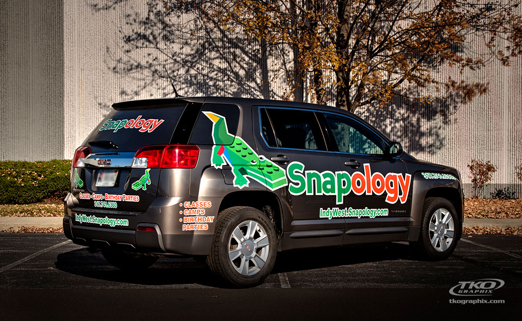
Snapology
“The partial wrap of the Snapology GMC Terrain gets the job done. Its message is clear and to the point. There’s no mistaking the brand with the legogator logo and branded soft green and orange corporate colors. I especially like the rear window film—Snapology stands out to everyone in front of, beside, or following this vehicle.” — Snapology GMC Terrain Partial Wrap
The tail of the legogator extends into the side glass, if it hadn’t the size of the Snapology brand logo would have needed to be reduced by nearly 50% to fit. I don’t believe it would’ve been recognizable if it were reduced that much – at least not when the vehicle was on the road.
 5-Star Party Bus
The 5-Star Dance Studio Wrap is a case study in taking a 1993 plain white bus and transforming it into a moving dance party. One of the keys to the transformation is the use of window graphics. By swirling the dancing couples onto the glass, the design adds dimension and movement. When the bus is moving, you can almost see them dancing.
“This 5 Star Dance Studios full wrap is eye-catching — it’s almost electrifying.
“The key elements to this design were installed in stages. The 1993 Provost bus began as an all-white vehicle. Layers were applied including:
• Outline colors
• Lettering
• Images of dancers
• Window graphics
• Reflective material
The entire design pops, but it’s the final touch of reflective material that literally makes this full wrap glow.” — 5-Star Dance Studio Party Bus Wrap.
Here’s a one-minute video showing the process from plain white bus to party bus, 5-Star Party Bus Wrap Video
Omalia’s Living Van Wrap
Here’s another example of how to use window graphics to send the best message. Check out the rear window. “The O’Malia’s Living vehicle graphic design is about branding. All you have to do is look at their website or the sign in front of their office, and the dots are connected. The van looks like O’Malia’s Living. It represents the organization, and whether parked at a customer’s home or business, it shouts O’Malia’s Living is here. And isn’t that what vehicle graphics branding should do?” — Omalia’s Living Van Wrap is about Branding

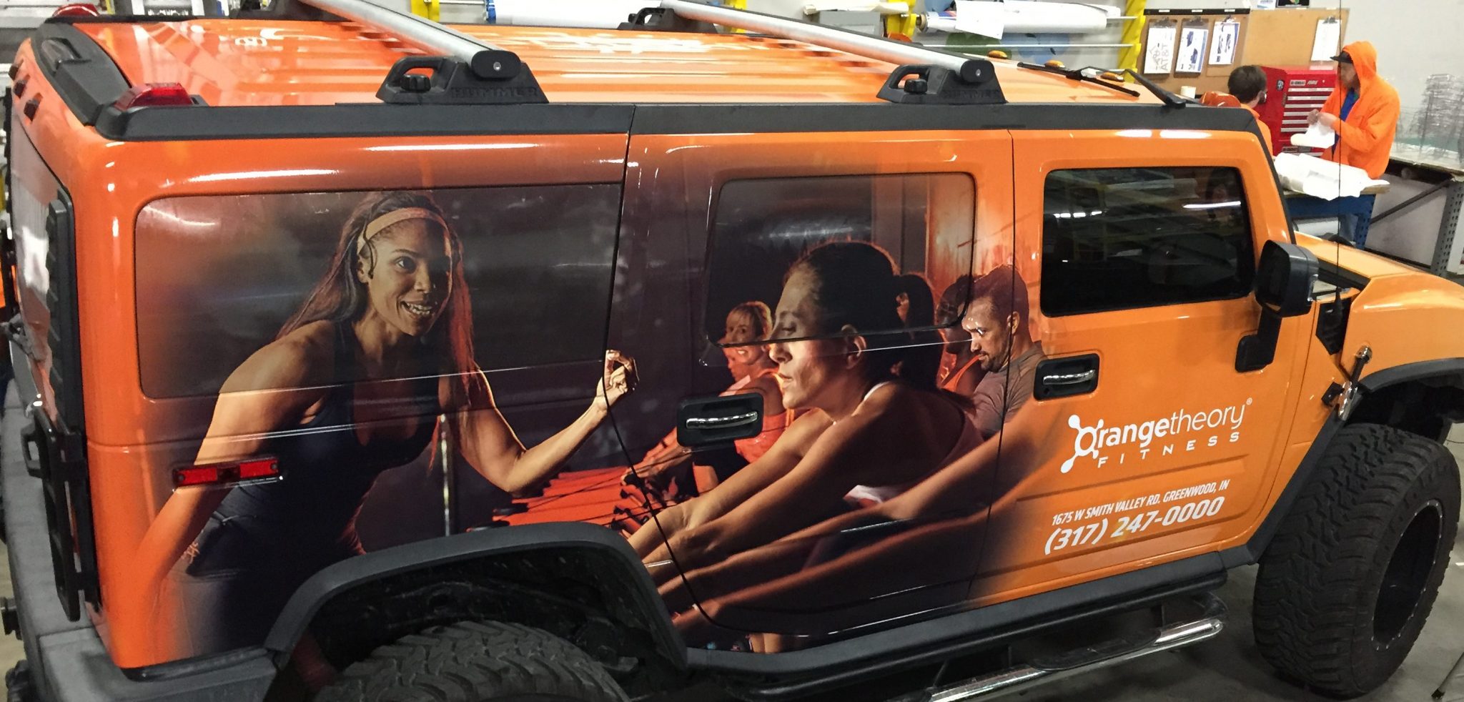
OrangeTheory Fitness vehicle wrap in the shop
Orange Fitness
This might be my favorite example of how to use window graphics, because without them design would not work. However, with the use of window graphics, the message is delivered loud and clear.
Dalton Amazing Grace
I love this photo, which was casually taken by our president Tom Taulman II. Check out the cross rising into the glass – it wouldn’t have worked without the window graphics.
 Performance Paint
“The rear of the vehicle presented a not so unique problem that was turned into an opportunity. So much of the space on the rear of the vehicle is window it would be difficult to share a message large enough to be effective.
Also, if the message were reduced to fit the space available on the rear, it wouldn’t match the font size on the rest of the vehicle. You know the answer.”

Frigid Frog vehicle graphics
Frigid Frog
“Near the end of last year, TKO Graphix ran a contest for a free vehicle wrap. One of the stipulations of the contest was for the business to write a short essay as to why they should be considered. I was privileged to be part of the team that picked the vehicle wrap winner. It was difficult to decide, so we didn’t pick one winner – we chose two. One was this Frigid Frog vehicle wrap.” — Frigid Frog Vehicle Wrap.
All you need do is look at the Frog wrap, and you realize how important the window graphics are to the overall design.
Are Window Graphics Safe?
According to 3M’s statement on its 3M Scotchal Perforated Window Graphics, “This 4-mil cast vinyl film allows a full image to be seen on the outside while allowing viewing through windows from the inside. A 50 percent perforation pattern enhances light transmission for a good balance of viewing through the window and image density as viewed from the outside.”
Are Window Graphics legal?
“The best answer is in most municipalities’ window graphics, and tints are legal with restrictions, but it’s best to check your city, county, and state ordinances. For example, window tints are gauged by VLT (Visible Light Transmission).
*Tint darkness for sedans:
- Windshield: Non-reflective tint is allowed above the manufacturer’s AS-1 line.
- Front Side windows: Must allow more than 30% of light in.
- Back Side windows: Must allow more than 30% of light in.
- Rear Window: Must allow more than 30% of light in.
*Tint darkness for SUV and vans:
- Windshield: Non-reflective tint is allowed above the manufacturer’s AS-1 line.
- Front Side windows: Must allow more than 30% of light in.
- Back Side windows: Any darkness can be applied several (unspecified) inches from the top of the window.
- Rear Window: Any darkness can be applied several (unspecified) inches from the top of the window.” — Are Vehicle Window Graphics legal?
— FAQ: Are Window Graphics Safe?
*Information provided by Tinting Laws Indiana
It’s a Window of Opportunity
Modern window graphics materials add to a graphics designers’ ability to share a message. Since the advent of adhesive vinyl graphics, made exclusively for glass area, the ball game has changed. How to use window graphics depends on your message and vehicles. Are your fleet graphics taking advantage of this window of opportunity? If you’d like to learn more, Contact Us.


 5-Star Party Bus

 Performance Paint


