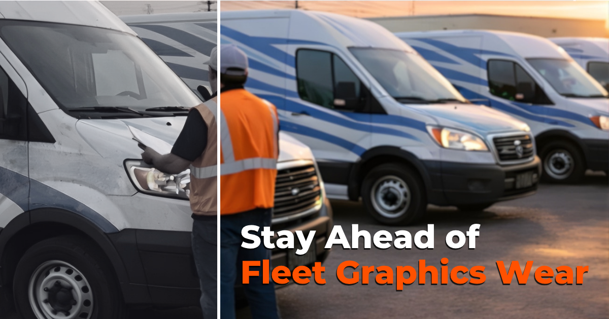
Before you design your fleet graphics, you should answer the four questions in this post. Fleet graphics can be one of the most effective tools in your marketing toolbox. However, it all comes down to your fleet graphics design. A fleet graphics design mistake can diminish your advertising effort, disrupt your brand, and share the wrong message. Here are a four points to consider before you design your fleet graphics.
Before You Design Your Fleet Graphics Answer these 4 Questions
1. Are you staying on brand?
It’s easy to lose sight of your brand when you design your fleet graphics. Unlike your website, social media, and print collateral, cars and trucks are three dimensional, and not every vehicle in your fleet is the same. The key to staying on brand is following brand guidelines, including colors, fonts, logos, and taglines.
Anyone who sees your vehicles, who has also seen you online, in advertisements, or on social media, should immediately recognize your vehicle. A consumer should know who your van, truck, or car represents before they read the copy. They should know it’s you because it looks like you.
“Advertising on vehicle graphics is no different in principle than any other form of advertising. Once a strong brand identity has been determined, it must remain consistent and reliable to the consumer. The excitement of vehicular advertising often leads companies to design each vehicle in a striking and visually stunning way, but with a complete lack of consistency across their fleet. If no two vehicles are the same in their use of graphics, or color scheme, then consumers will not consistently identify the brand.” — Vehicle Graphics: How To Achieve Maximum Branding Impact On Wheels
2. Have you thought about the design hierarchy?
What is the design hierarchy? Simply put, it’s the order of importance of your message. Deciding the primary and secondary messages of your fleet graphic design will help the design team create a graphic that shares the message you want to send.
“Before setting vehicle graphic design hierarchy in order, an organization must consider what messages take precedence, what is the hierarchy of your messages? What do you want to communicate and what do you want people to understand about your business.” — Vehicle Graphic Design Hierarchy
Before you design your fleet graphics keep in mind that the design hierarchy may include logo, taglines, CTA (Call to Action), contact information, USP (Unique Sales Position), products, and services.
3. What color is best for you?
Why would color be a consideration? Aren’t you supposed to use your brand color guidelines? Yes, absolutely. However, there’s more to consider, such as the painted color of the vehicle. If it’s a full wrap, the vehicle’s color will not matter, but if it’s a partial wrap or a decal, the vehicle color can be impactful.
One way to control this is to order the best color of the vehicle at the start. White is usually good, but you may be able to choose a color that is close to your brand.
Another way to match the vehicle color to your brand is by outlining the graphic. Let’s say you have a white delivery van, and your logo is mostly white. A white logo on a white van would be virtually invisible. However, if you outline around the edges of the logo in a contrasting color such as blue the logo will stand out.
“What color should I wrap my business vehicle is a good question. Because color is often more important to successfully sharing a message on fleet graphics than any other aspect of vehicle wrap design. When choosing colors for your vehicle graphics, it may not be what color, but how colors of both the vehicle and your graphic contrast.
Using poorly contrasted colors reduces the impact of vehicle advertising. Poorly chosen hues, designs that hide the message, and colors that don’t match your brand waste your marketing dollars. One should first consider the brand, logo, and vehicle colors and how they contrast with the color of the vehicles or the background of the graphic design.” — FAQ: What Color Should I Wrap My Business Vehicle?
4. Where should you position the information?
Once you’ve decided on the design hierarchy, where do you position your messages? Part of the decision will depend on the type of vehicle. A company car will share a message much differently than a 53-foot trailer. I’m going to state the obvious, but your primary message should take center stage. The reason I’m telling you this is that the message can be lost in the design.
“When designing graphics for a moving vehicle, less is more. Short and sweet, simple, and to the point, are the keys to creating a vehicle graphic that does its job. And what’s that job? Its job is to capture people’s attention and then share a message. Too much information, too many words, multiple images, and distracting colors take away from the task. KISS — “keep it simple stupid.”
With the advent of digital printers, modern vinyl adhesives, and state of the art inks, there’s a tendency to overdo it. Just because it can be done doesn’t mean it should be.” — 4 Steps to Making Your Vehicle Graphics Pop
Another consideration is that your key messages should be on every side of the vehicle. Too often, we see vehicle graphics that only share the name, logo, and contact information on the driver and passenger doors. But what if a potential customer is in front of your vehicle or behind it?
“I was stuck in traffic behind a business’s van while coming home for work last week. I sat directly behind it for several minutes. The graphics covered most of the back of the van, including the window. I had plenty of time to view their product list, branded logo, tagline, and call to action. And I’ll remember this business if I ever need their services.” — Don’t Forget the Back of Your Fleet Vehicles
Before you design your fleet graphics think about how large the different design features should be. Your primary message should be the largest, but how big is that?
The USSC (United States Sign Council) uses a formula to determine the optimum signage square footage required for a sign to be seen by moving cars. VRT (viewer reaction time) + MPH/800 = recommended square footage for a stationary sign. This will vary by road complexity.
How can we be of assistance?
“When it comes to making your graphics a reality — it all begins with our design department services. From a concept on paper to road-worthy advertising for your vehicles, our designers can help bring your vision to life. Our team specializes in creating fleet and vehicle graphics while keeping your brand consistent across all types of vehicles in your fleet.
Before you design your fleet graphics you should know that whether you need artwork created, or you have existing artwork, our design team will work with you to create what you need quickly and cost-effectively to Drive Your Brand.” — TKO Graphix Services
If we can answer any questions or offer our advice, please let us know. And if you’d like our professional design team to walk you through these four questions, Contact Us.
If you enjoyed this post, you might also appreciate this one, 10 Steps to Building a Business Brand.
Photo by Jeroen den Otter on Unsplash