This post, How to Proof Your Vehicle Graphics Layout so it Doesn’t Cost You Time and Money was born when I asked TKO Graphix sales, design, and customer service staff for helpful advice that TKO might offer customers. One topic suggested by several members of the sales team was how to proof your vehicle graphics layout.
It seems too often, customers take a quick or incomplete look at the layout, and then sign off on it. If there’s a mistake, and TKO doesn’t catch it — that’s a problem. A provider, such as TKO Graphix, may find errors, but if it has to do with color, style, or content, the customer is the best person to review the information. Here are a few key points on how to proof your vehicle graphics layout.
How to Proof Your Vehicle Graphics Layout 7 Check Points
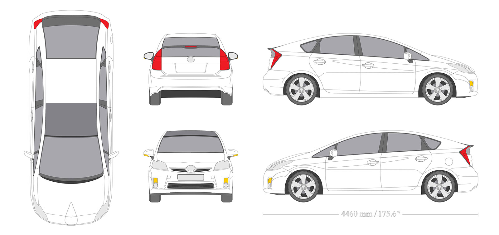
Is it the right vehicle?
Seriously, this is often overlooked and can be a major disruption causing delays and cost overruns. For example, are there variations of your vehicle on the layout such as, extended cab, crew, or regular.
So, a good place to begin on how to proof your vehicle graphics layout is checking the vehicle. Do serial numbers match? Do they have the correct year, model, and package? If it isn’t a full wrap is the color of the vehicle correct?
Please, do not underestimate the importance of checking this. I can’t tell you the number of prospects that have come to us for help because another provider printed graphics for their extended cab that wasn’t an extended cab. So, be certain the right vehicle template was used for your design. Proof your vehicle graphics layout by proofing the vehicle!
Look at All Sides of the Vehicle
To properly proof your vehicle graphics layout you have to check every view. Check every side of the vehicle, front, rear, and both sides. Check to see how the graphics are aligned. Do they fit the space? Is it the message you want to send and does it fulfill your purpose? Imagine the vehicle on the highway or parked at your shop, what kind of impression does it make? Before signing off be certain that the design works from every view of your fleet vehicle, because what good does a vehicle wrap do if a potential customer see’s only one side of your car or truck and the side they see doesn’t have your contact information?
Colors
Are your businesses branded colors being used? Be sure to not only check the color on your logo, but also on the background, foreground, and fonts. “When choosing colors for your vehicle graphics, it may not be what color, but how colors of both the vehicle and your graphics contrast. Using poorly contrasted colors reduces the impact of vehicle advertising. Poorly chosen hues, designs that hide the message, and colors that don’t match your brand waste your marketing dollars. One should first consider the brand, logo, and vehicle colors.” — What Color Should I Wrap My Business Vehicle?
Copy
Is the content what you want and is it grammatically correct? A misspelled word or misplaced apostrophe can ruin a vehicle graphic and hurt your brand. I saw a sign the other day that omitted the last digit of the business’s phone number. I wonder who proofed that layout.
Too much copy creates a problem. A vehicle graphic isn’t the place to attempt to advertise every product and service you offer, share your complete company history, and place 10 quotes from satisfied customers.
Materials
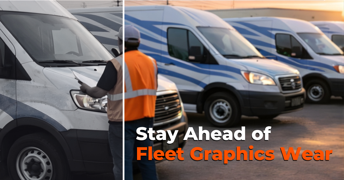
Do you understand the adhesive vinyl being used and does the material fit the purpose of your vehicle graphics? For example, “Cast, or premium vinyl, is a process similar to making a cake. Ingredients are mixed and solvents are added, and then poured into a casting sheet, which is baked, allowing the solvents to evaporate. This process makes a very flexible, thin, shrink-resistant material. Another manufacturing option is the calendar or economy process. In this method, ingredients are mixed, and then solvents aren’t added. Like pizza dough, the vinyl is rolled and stretched into the desired shape. This material is thicker and having been stretched, it tends to shrink.” — Are There Different Vinyl Graphics Materials?
Cast vinyl is best suited for full and partial wraps. It’s manufactured to be able to be stretched around complex curves whereas as calendar, or economy vinyl, isn’t. While economy vinyl may be appropriate for flat surface applications it can lead to problems when used for more demanding installations.
Fonts
Does the font fit the style guide of your organization and is it easy to read? Is it the best size? “Any combination of font style, size, and color can and will affect the readability of vehicle graphics. The key to effective fleet graphic design is combining appearance with legibility. There are too many designs, which although visually striking, are difficult to decipher, which detracts from the purpose of vehicle advertising.” — What’s the Best Font for Vehicle Graphics?
Hierarchy
Is top billing given to your most important message? Are your priorities in line? “Before setting vehicle graphic design hierarchy in order, an organization must consider what messages take precedence, what is the hierarchy of your messages? What do you want to communicate and what do you want people to understand about your business.” — Vehicle Graphic Design Hierarchy
Other Points to Consider
- Do not sign and therefore approve a layout until every member of your team who has the authority to approve or disapprove the layout has reviewed it. Unfortunately, we’ve experienced producing an approved layout to learn a senior executive didn’t like it and wanted it changed.
- Measure twice cut once. Don’t take a quick look at the layout and sign off. Take your time and review it completely and then review it again. It also might help to have others on your team proof it as well.
Don’t Sign Off Early
When a vehicle graphics provider sends a layout to a customer for approval, the sales and design team are asking, “Does this meet your expectations?” You should be certain it is what you want.
“Graphic design is a collaborative effort between designer and client. The client wants his vision brought to life through your talents, and it’s important to him that he gets what he wants.” —Sign Craft Magazine
When a layout is signed and approved, the design goes into production. Changes after a layout has gone into production can be costly and time-consuming.
When clients don’t take the time to thoroughly check and double check the layout, mistakes can happen. Before signing off on a layout, take enough time to check and recheck the seven points above, and then get the okay from everyone on your team who is involved. If we can answer any questions for you, please let us know. Contact Us.

